
Budgets, statistics and subscriptions
How to read your statistics in Penge
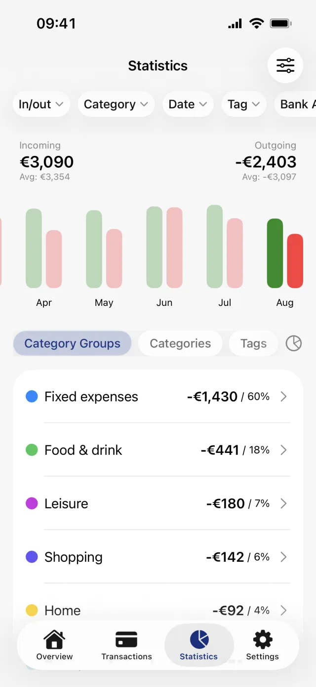
The Statistics tab shows one period at a time. The totals, the bars and the list underneath all follow the period you have selected, and the screen opens on the current month rather than on everything you have.
What does the Statistics tab show?
One period at a time, starting with the current month. The header gives income and expenses for that period, the bar row moves you between months or years, and the list underneath breaks the period down by category group, category or tag. Reserved transactions are left out of every figure.
Move between months with the bars
The row of paired bars gives one green income bar and one red expense bar per period. Tap a pair to switch the whole screen to that period, and tap the selected pair again to clear it and see all-time totals instead. Bars are scaled against the largest figure in the row, so the same height means different money in different months.
Good to know
- Tapping a bar does not set the Date filter chip. The two are separate and both apply at once, so the narrower of them wins when you open a transaction list.
- A month with no transactions has no bar at all, except the current one, which always gets a bar.
Income against expenses
- Incoming on the left is money in. Outgoing on the right is money out, shown as a negative amount.
- The Avg: line under each total is a trailing average of the last six completed months, or the last three completed years in Year aggregation. It always skips the current period and skips periods with nothing in them, so it is not the average of the bars you can see.
- Both totals are buttons. Tapping one keeps only income or only expenses, and the same choice sits in the In/out chip as Money in and Money out. That filter is shared with the Transactions tab.
The three breakdowns
- Category Groups is the default. Tapping a group row expands it in place; only the category rows inside it open a transaction list.
- Categories lists every category, plus two rows for money with no category at all: Uncategorized income and Uncategorized expenses.
- Tags lists the tags used in the period, favourites first. A transaction with two tags counts in full under both, so the tag totals can add up to more than the period's spending. It is not a division of what you spent.
The donut chart
The pie-chart icon at the right end of the chip row puts a donut above the list. It plots expenses only, for whichever breakdown is selected, and income never appears in it. Tapping a segment dims the rest and filters the list to it; tapping the middle of the ring clears that again. The chart is hidden by default and does not remember its state, so it is hidden again the next time you open the screen.
The settings popover
The sliders icon in the top right of the navigation bar opens four controls.
- Month or Year. Switching also jumps the selection to the current month or year rather than keeping you where you were, and Penge remembers which of the two you last used.
- Apply modifiers, on by default. With it on, tag and account percentages are already worked into every figure on the screen.
- Show excluded categories, off by default. This is why money you move into Saving is missing from your statistics until you turn it on.
- Show percentage, on by default. Income rows and expense rows are each their own hundred percent, and inside an expanded group the child rows are shares of that group.
Good to know
- There is no export, share or print anywhere on this screen, and no week or quarter aggregation.
- Foreign-currency transactions with no exchange rate for their date are left out of the totals and listed separately under a warning banner, in their own currency.
- A typical month is a different screen and lives on Overview. See what a typical month looks like.
Get a full overview with Penge
Connect your bank and let the app categorize and budget automatically.
Questions about this
- Why is my saving missing from the statistics?
- Because Show excluded categories is off by default. Penge ships two groups that are excluded from statistics, Saving and Excluded from statistics, and the money in them is invisible here until you turn that toggle on in the settings popover.
- What exactly is the Avg: line?
- A trailing average of the last six completed months, or the last three completed years when you are in Year aggregation. It leaves out the current period and any period with nothing in it, so it is not the total divided by six.
- Do the Overview cards show the same numbers?
- Not always. Monthly summary and Year in review are separate features on Overview. They always use modified amounts and always leave excluded categories out, so the Statistics toggles do not change them.
- Why did filtering here change my Transactions tab?
- The filter chips are global, not a view mode for one screen. Tap the funnel chip at the far left of the chip row and choose Clear all filters to turn everything off in one go.