
Budgets, statistics and subscriptions
What a typical month looks like
A typical month averages the months you have finished, so it answers what a normal month costs rather than what this month has cost so far.
Where is A typical month?
On the Overview tab, under the Insights heading, as a card titled A typical month with the subtitle What a normal month looks like. Tap the card to open the screen. It stays hidden until you have transactions in a month that has already finished, so a brand-new account cannot find it yet.
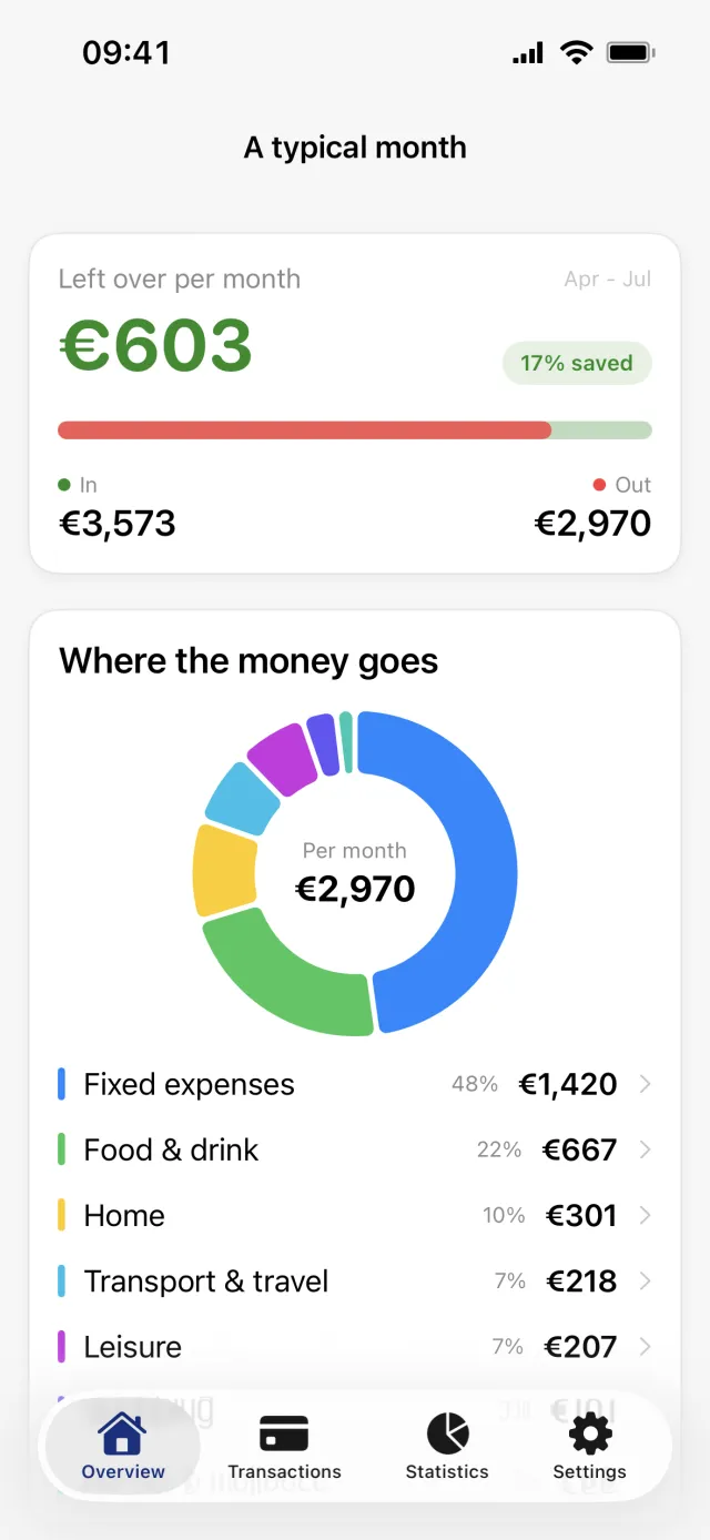
Which months the figures average
- Exactly the last four completed months that hold data. The window is fixed and cannot be changed.
- Those four need not sit next to each other. A month with no transactions is skipped and an older one takes its place.
- The current month is always left out, because it is not finished.
- Amounts always have tag and account modifiers applied, and categories in an excluded group are always left out. The toggles on the Statistics tab do not reach this screen.
What the screen shows
- Left over per month at the top, or Short per month when the average month spent more than it took in, with In and Out under it.
- A green pill with the share of income saved. It appears only when there was income and the average month ended in the black.
- Where the money goes, a donut grouped by category group.
- Biggest categories, a bar chart of the eight largest categories. Everything below those eight is folded into a single Everything else row, which is not tappable.
- Average per recent months at the foot, naming the months behind the figures.
- Tapping a group row under the donut, or a bar in the chart, opens the transactions behind it. Tapping a slice of the donut itself only highlights it and names it in the middle of the ring.
What it does not tell you
Good to know
- It is an average, not a forecast. Nothing here predicts the month you are in or any month to come.
- Money in an excluded group, Saving for example, is left out here whatever the Statistics tab is set to.
- The donut is grouped by category group and the bar chart by category, so the two do not show the same slices.
- Uncategorized spending lands in its own row rather than being spread over the categories it might belong to. Categorizing your history changes what this screen says.
For the period-by-period view of the same data, see how to read your statistics.
Get a full overview with Penge
Connect your bank and let the app categorize and budget automatically.
Questions about this
- I cannot find the card. Why?
- The card is hidden until you have transactions in a month that has already finished. If you have opened the screen but it is empty, it says your average month shows up once you have a full month of transactions.
- Can I change the four months?
- No. The window is four completed months with data, fixed in the app. There is no setting for a year, for all time, or for a range of your own.
- Why does it not match the Statistics tab?
- Different window and different rules. Statistics shows one period at a time and lets you switch modifiers and excluded categories on and off. A typical month averages four finished months and always applies modifiers and always drops excluded categories.